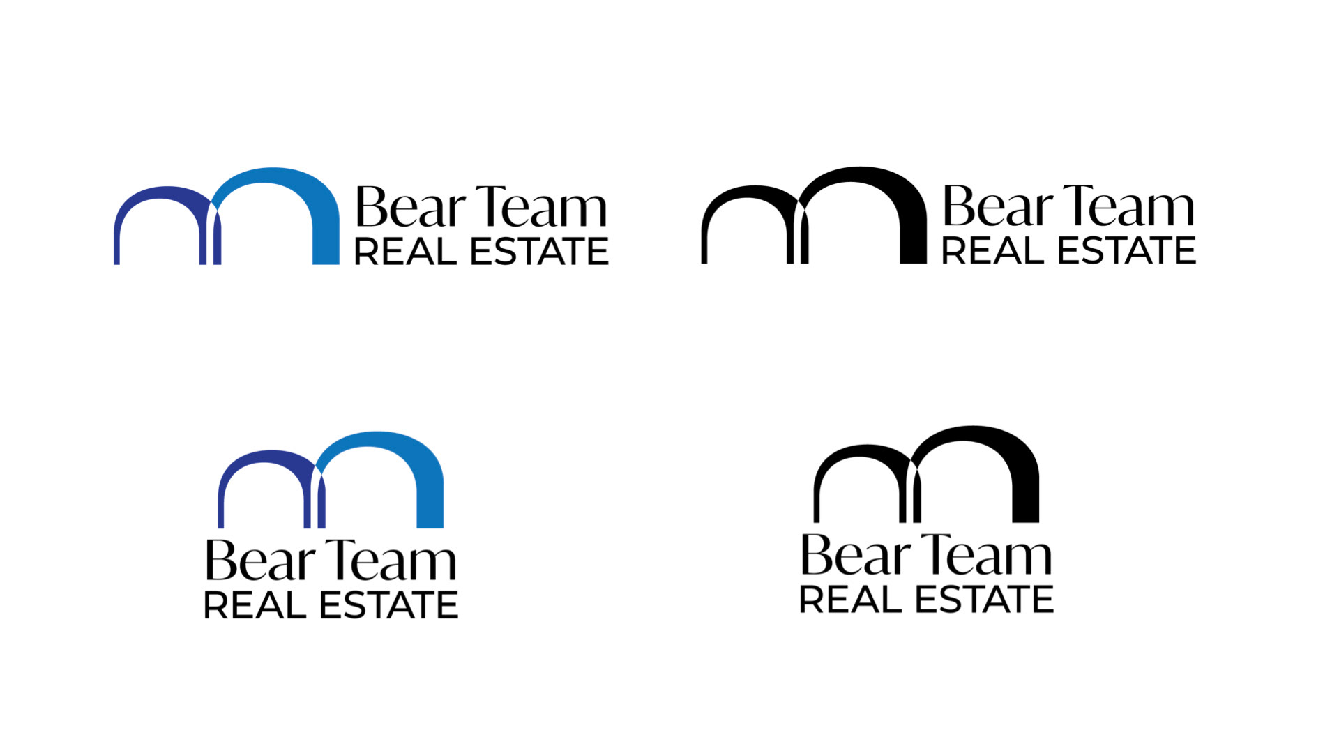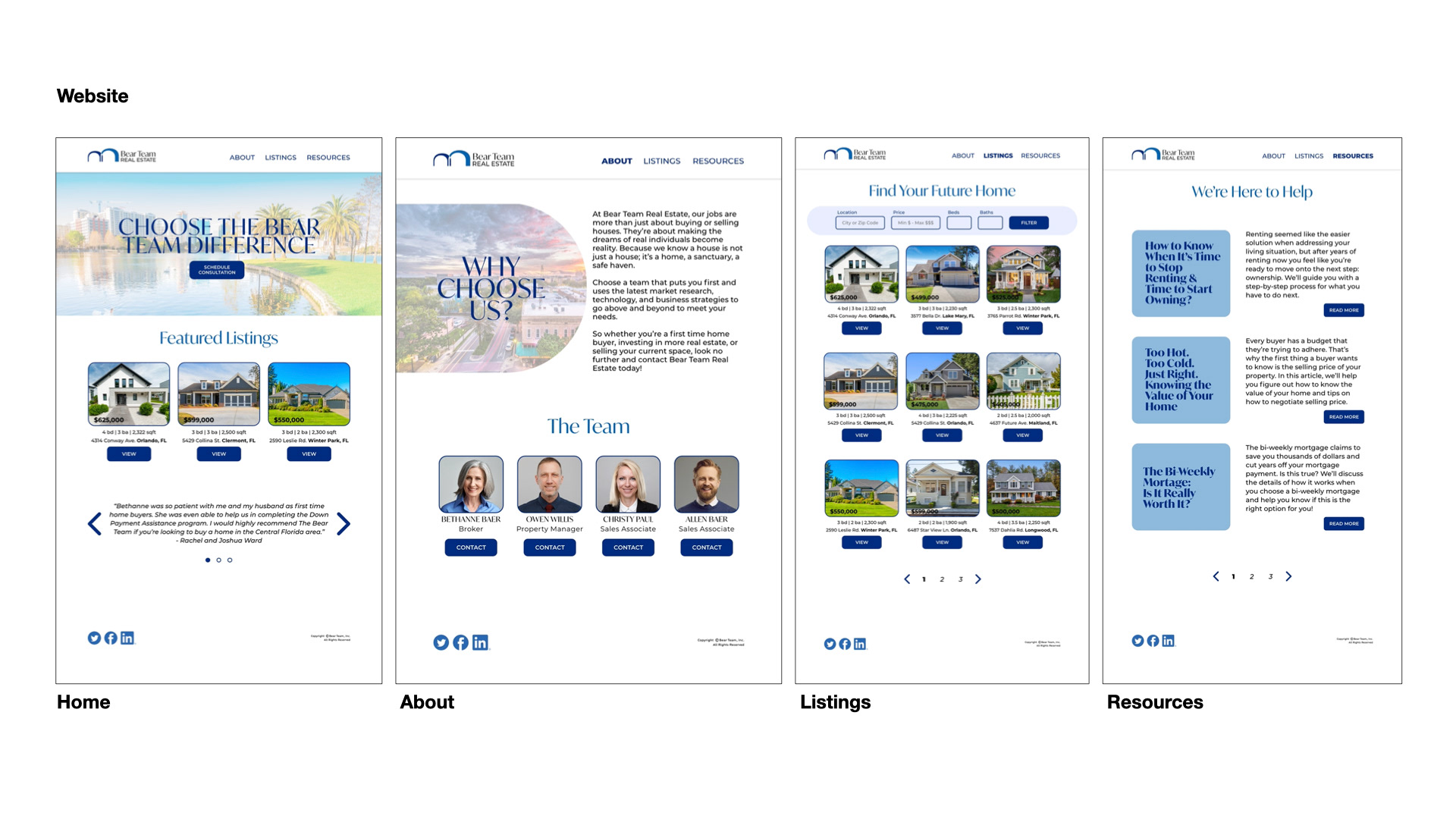
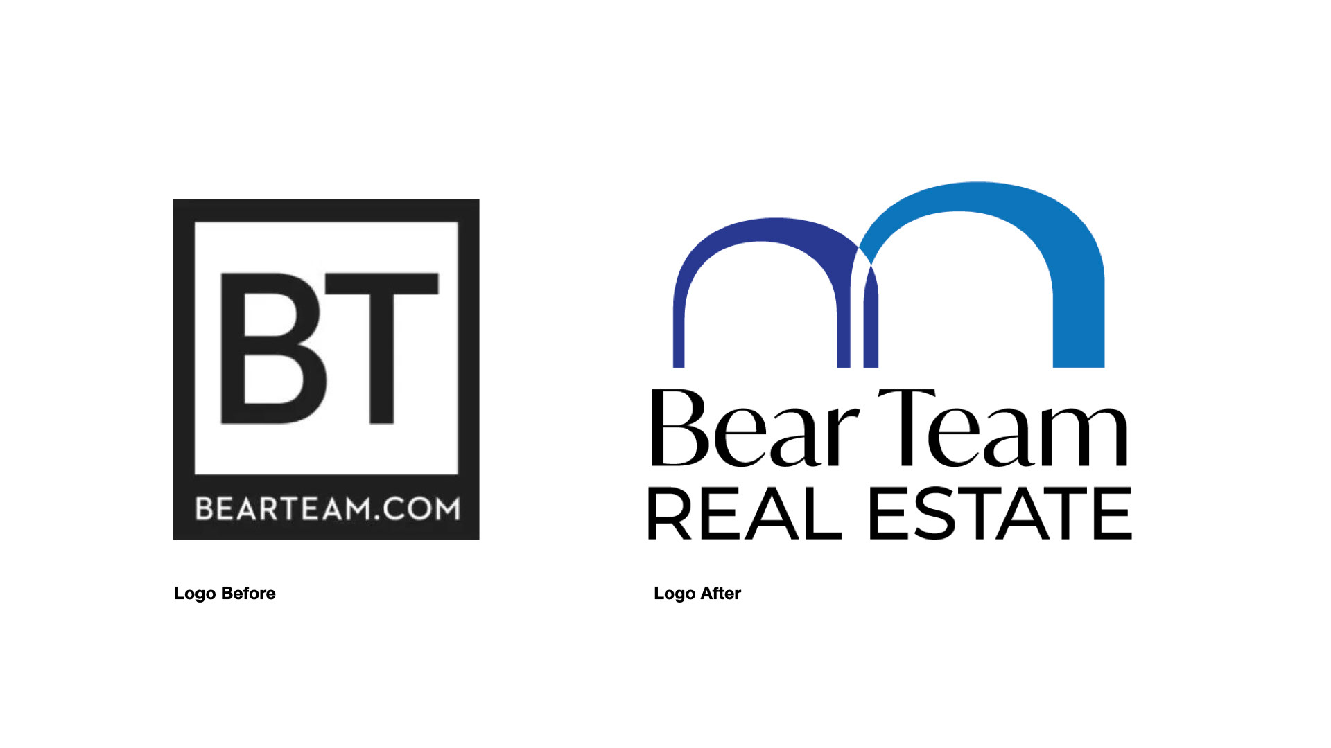
The logo for Bear Team Real Estate was reimagined to better reflect the company’s professionalism, forward-thinking strategies, and commitment to client accessibility. The new icon is an abstract representation of a den and a welcoming archway, symbolizing the journey to a new home. Paired with a sleek, modern typeface, the updated design moves away from traditional real estate aesthetics, positioning the brand as contemporary, approachable, and distinct in a competitive market.